
A baby example of generative modelling
This is the very first lesson of a course in which we will discuss generative modelling. In a previous course we already discussed how supervised learning works. With these algorithms, the computers learns to classify distinguish data based on some labels we give him. Often we take the example were the algorithm gets labelled images of cats and dogs. At some point it will be able to classify also other cats and dogs.
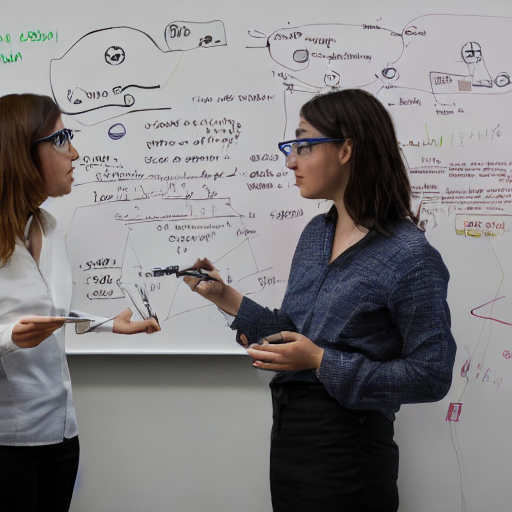
But what happens when no labels are available ? This is the field of generative modelling is a sub-domain of machine learning (ML). The goal is to learn from (often unlabeled) data, to generate similar but previously unseen data. Generative Models have undergone a series of breakthroughs in the last decade, with state of the art generative models like GANs and Diffusion Models. As a very practical example I asked stable diffusion to provide me “a portrait of two female scientists sketching generative models on a white-board”. And as a result we obtained the provided image. Feel free to try it for yourself here.
But what are generative models and what do they have to do with quantum computers? In this lesson, we will go over an example of an intuitive generative modelling task. It highlights many of the building blocks that we can later replace with quantum circuits.
The data for generative modelling
Just like in any machine learning task, we start out with data. This will be the training data for our machine learning algorithm.
# The usual imports
import numpy as np
import matplotlib.pyplot as plt

data_samples = np.array(
      [-3.61078109e-01, -1.29291442e-01, -9.82588388e-02, -2.58432923e-01,
       -4.97863965e-01, -4.78795061e-01, -5.10663163e-01,  4.36223299e-02,
       -1.01858250e-02, -5.57657880e-01, -5.61011437e-01, -2.63656495e-01,
       -5.00136079e-01, -6.30125377e-01, -1.12999295e-01, -3.22838879e-01,
       -7.75881873e-01,  1.68190537e-01, -2.69496934e-01, -3.04754810e-01,
       -2.62099948e-01,  1.36922064e-01,  3.93391710e-01, -8.12181958e-01,
       -3.15903057e-01,  1.10533721e-01, -2.50864695e-01,  6.56386891e-02,
       -2.37497275e-01, -6.04398679e-01, -5.32560555e-01, -1.62669444e-01,
       -4.45701188e-01, -1.67952827e-01, -5.07722157e-01, -8.51854037e-02,
       -1.35821066e+00, -3.39440908e-01, -6.41656480e-01, -9.51452941e-01,
       -8.23083293e-01, -5.69844420e-01, -1.04400576e-01, -3.71350420e-01,
       -8.65458568e-01, -2.64222047e-01,  8.06578890e-04, -5.68337779e-01,
       -6.25077227e-01, -1.00012510e+00,  7.59518951e-01,  2.46827712e-01,
        5.70561107e-01,  6.52003162e-01,  6.73384341e-01,  8.04894781e-01,
        6.34541410e-01,  3.63315273e-01,  4.36242632e-01,  3.31473086e-01,
        5.18170902e-01,  6.00943305e-01,  7.09919182e-01,  5.42156544e-01,
        5.96010036e-01,  6.32350524e-01,  5.11792431e-01,  7.26352234e-01,
        5.24889933e-01,  6.33500447e-01,  7.76251971e-01,  7.53647980e-01,
        3.36153030e-01,  8.15441364e-01,  5.57272462e-01,  1.44661947e-01,
        6.16792976e-01,  6.91086153e-01,  6.87286823e-01,  3.98429153e-01,
        1.07054311e+00,  6.24690432e-01,  6.84406406e-01,  7.26905590e-01,
        3.09651946e-01,  7.78085930e-01,  3.60425786e-01,  6.33481589e-01,
        3.17310855e-01,  6.56363955e-01,  6.10979533e-01,  8.08938177e-01,
        7.71336408e-01,  6.11452930e-01,  5.03192825e-01,  5.66868324e-01,
        7.22434360e-01,  5.64687162e-01,  5.11510302e-01,  7.02255988e-01]
)
Here we have 100 numbers stored in a numpy array. You can think of them as 100 images with one pixel each, or any other kind of data which only has 1 dimension. Let’s assume that this is data that we collected in the real world, and that there was a process behind the data generation, i.e., there exists a set of rules that produced this data. In more mathematical terms, this dataset consists of data samples  , and the process that generated the data is characterized by the probablity distribution
  . This probability distribution is generally not known, but it is what we are interested in. Because our goal in the context of generative modelling is to build a model of , which encodes a probability distribution
  , and which approximates the true data distribution
  . We then want to generate new data samples using our model which follow similar rules as the true data, but we they are novel. We don’t have to go out into the real world again to collect all possible similar data, we just have to learn the rules behind how the data is created. However, the only evidence we have are the data samples, i.e., the above
 numpy array consisting of 100 numbers.
Lets take a first look at the data:
fig, ax = plt.subplots(1,1)

ax.scatter(data_samples, np.zeros(len(data_samples)), alpha=0.3)

ax.set_title("Occurences of the Data", fontsize=16)
ax.set_xlabel("Data Value", fontsize=16)
ax.set_ylim(-0.1, 0.3)
ax.set_yticklabels("")
ax.tick_params(labelsize=14)

plt.show()

This plot shows that the samples in the dataset are mostly in the domain [−1,1]. Lets check out the density of the data samples through a histogram plot:
fig, (ax1, ax2) = plt.subplots(1,2, figsize=(14, 5))

ax1.hist(data_samples, bins=15, alpha=0.5, edgecolor="royalblue", linewidth=2)
ax2.hist(data_samples, bins=100, alpha=0.5, edgecolor="royalblue", linewidth=0.2)

ax1.set_title("Wider Histogram Bins", fontsize=16)
ax2.set_title("Narrower Histogram Bins", fontsize=16)
ax1.set_xlabel("Data Value", fontsize=16)
ax1.set_ylabel("Occurances", fontsize=16)
ax2.set_xlabel("Data Entry", fontsize=16)
ax2.set_ylabel("Occurances", fontsize=16)
ax1.tick_params(labelsize=14)
ax2.tick_params(labelsize=14)

plt.show()

We plot two histograms with wider and narrower bins, which gives us a sense of coarse and fine trends of the dataset distribution.
We plot two histograms with wider and narrower bins, which gives us a sense of coarse and fine trends of the dataset distribution.
Designing a simple generative model
Do you see a familiar structure in that data? It may remind you of a gaussian distribution! In this simple example, could it be the case that the data was generated from two gaussians?
Gaussian distributions are characterized by the parameters  (the mean of the gaussian) and
  (the width of the gaussian). The density
  of the distribution around each point
  in the data space is then defined as:
![\[\rho(x; \mu, \sigma) = \frac{1}{\sigma\sqrt{2\pi}} e^{-\frac12 (\frac{x-\mu}{\sigma})^2}\]](https://alqor.io/wp-content/ql-cache/quicklatex.com-bdc55717c1cc981d1c085bb979f6b121_l3.png "Rendered by QuickLaTeX.com")
Lets code it up:
def gaussian(x, mu, sigma):
    return np.exp(-0.5*((x - mu)/sigma)**2.) / (sigma*np.sqrt(2*np.pi))
If we assume that the true underlying distribution is well-approximated by two gaussian distributions, we might be able to build a model, which represents our best guess of the underlying distribution for an optimal set of parameters  and
and  . The model density consisting of two gaussians and parameters
  can be defined as
![\[\rho_{model}(x) = \frac{\rho(x; \mu_1, \sigma_1) + \rho(x; \mu_2, \sigma_2)}{2}\]](https://alqor.io/wp-content/ql-cache/quicklatex.com-f55a92bf8ba5dbd87be3fec5b6066836_l3.png "Rendered by QuickLaTeX.com")
And in Python:
def model_density_function(x_points, mus, sigmas):
    density_left = gaussian(x_points, mus[0], sigmas[0])
    density_right = gaussian(x_points, mus[1], sigmas[1])
    return (density_left + density_right)/2
Which appear to be reasonable initial guesses for the parameters? To keep it simple, we choose  , which are close to the peaks that we observe in the histogram with wider bins. For the width of the gaussians, we remind ourselves that approximately
  of the area under a gaussian distribution is inside one standard deviation . So how about we choose
  .
.
model_mus = [-0.3, 0.6]
model_sigmas = [0.2, 0.2]
When we input these values for and into the model density function, and then scan values of , we get the following plot:
fig, ax = plt.subplots(1,1)

x_points = np.linspace(-1.5, 1.5, 1000)

plt.hist(data_samples, bins=15, density=True, alpha=0.5, edgecolor="royalblue", linewidth=2, label="Training Data")
plt.plot(x_points, model_density_function(x_points, model_mus, model_sigmas), color="red", linewidth=2, label="Model")

plt.legend(fontsize=15)
ax.set_ylabel("Density", fontsize=16)
ax.set_xlabel("Data Value", fontsize=16)
ax.tick_params(labelsize=14)
plt.show()

This already looks pretty good for a start into generative modelling! With this, we have implicitly defined the model distribution  ! Keep in mind that
  and are not the same thing. Instead,
  represents the area below the curve below the function, i.e. its integral.
Generating new data from the model
But one crucial step is missing to make the a generative model: the generation part. Luckily, we known how to efficiently sample random numbers from gaussian distributions, and the numpy library provides simple functionality for this:
def sample_model_distribution(n_samples, mus, sigmas):
    n_left_samples = n_samples//2
    n_right_samples = n_samples - n_left_samples

    samples = np.append(
        np.random.normal(mus[0], sigmas[0], size=n_left_samples),
        np.random.normal(mus[1], sigmas[1], size=n_right_samples)
    )
    return samples

# collect examples and plot it up

np.random.seed(42)
generated_samples = sample_model_distribution(1000, model_mus, model_sigmas)

fig, (ax1, ax2) = plt.subplots(1,2, figsize=(14, 5))

ax1.hist(data_samples, bins=15, density=True, alpha=0.5, edgecolor="royalblue", linewidth=2, label="Training Data")
ax1.hist(generated_samples, bins=15, density=True, alpha=0.5, edgecolor="red", linewidth=2, label="Generated Data")
ax2.hist(data_samples, bins=100, density=True, alpha=0.5, edgecolor="royalblue", linewidth=1, label="Training Data")
ax2.hist(generated_samples, bins=100, density=True, alpha=0.5, edgecolor="red", linewidth=1, label="Generated Data")

ax1.set_title("Wider Histogram Bins", fontsize=16)
ax2.set_title("Thinner Histogram Bins", fontsize=16)
ax1.set_xlabel("Data Value", fontsize=16)
ax1.set_ylabel("Density", fontsize=16)
ax2.set_xlabel("Data Value", fontsize=16)
ax2.set_ylabel("Density", fontsize=16)
ax1.tick_params(labelsize=14)
ax2.tick_params(labelsize=14)

plt.show()

We now have a full-fledged generative model for 1-dimensional data samples, where we can tune the parameters and then sample efficiently from .
Summary and outlook
Let’s recap what we have done so far and how this exemplifies common tasks in generative modelling. The moving pieces that we saw were:
- The dataset. How does it look like? Here, we had 100 1-dimensional data samples.
- The model. We want to learn a model of the true underlying probability distribution of the data,. In other words, we want to learn the distribution from which the data itself come from. In our case the highly specialized gaussian distribution.
After we plotted a histogram with the data, we made an educated guess that the true underlying distribution of the data consists of two gaussian distributions. With reasonable initial parameter guesses, we are now able to generate samples which apparently follow a very similar distribution to the original data samples. But is this machine learning? Not quite. The learning part is missing. We have a generative model. However, we were only able to guess the underlying structure because the task is rather simple. In later lessons, we will see how we can substitute the gaussian model by quantum circuits with many more parameters.
In more realistic cases, we won’t be able to guess such good initial models. This is why we build modern ML models with up to billions of parameters. Then we train them according to a loss function. And this is the topic of our next lesson.